

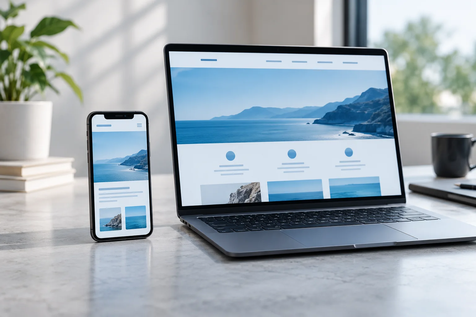
A website can look excellent on a large office monitor and still be frustrating on a phone. Smaller screens, different connection conditions, and touch interaction change the experience. A useful performance review asks whether a visitor can understand the page and complete a task comfortably, not only whether a testing tool produces an attractive score.
Choose a few important mobile journeys
Start with the pages customers actually need: a main service, a product or offer, and the enquiry or checkout journey. Test on a real phone as well as a resized browser. Notice when text becomes readable, whether buttons move while the page loads, and whether a menu obscures the information behind it. Record the device and connection conditions so later comparisons have some context.
Review the images doing the most work
Ask whether each image supports the page and whether its delivered size matches its display size. Very large original files can add unnecessary transfer cost. Responsive image delivery allows different screen sizes to receive more suitable assets. Reserve layout space for images so surrounding content does not jump as they arrive. Images near the beginning of the page and images far below it may need different loading strategies.
Reduce distractions and competing tools
List analytics tags, embedded widgets, chat tools, video players, and other third-party additions. Identify an owner and a reason for each one. A tool may be valuable, but its cost should be considered alongside the journey it supports. Remove abandoned experiments, test alternatives when a widget creates problems, and avoid introducing several new tools at once if you need to understand their effect.
Make forms comfortable to complete
Check visible labels, suitable input types, clear error messages, and enough space to tap controls without selecting their neighbours. Do not use placeholder text as the only explanation of a field. Try recovering from a mistake and returning after an interruption. A fast page can still lose a visitor if the form asks unnecessary questions or clears their work when a submission fails.
- Read the page without zooming.
- Open and close the navigation with one hand.
- Complete the primary form using a real phone keyboard.
- Confirm that an error explains how to recover.
Balance measurements with actual use
Use repeatable technical measurements to identify changes, then verify the experience through realistic tasks. A single test can vary with device conditions, caching, and network activity. Look for recurring issues and compare similar conditions. Prioritise improvements that affect important content or actions, and document which change was made so its effect can be understood.
Choose one high-value mobile journey, capture its current problems, improve the largest source of friction, and test that same journey again.
See how our web design & development service can help